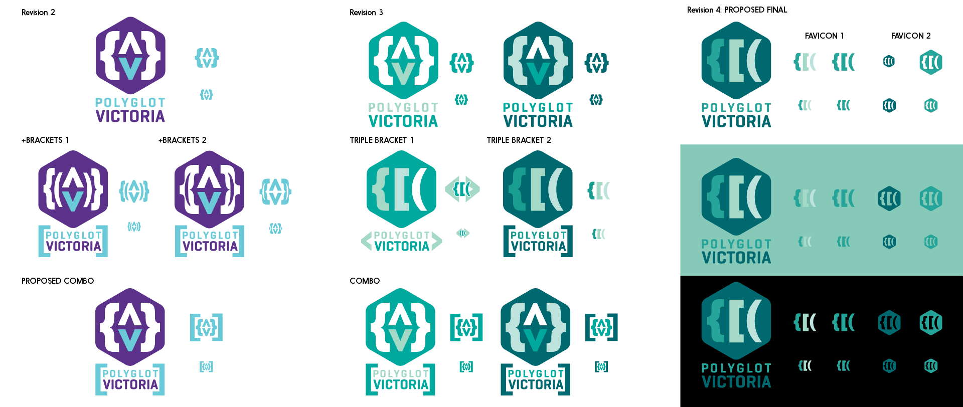
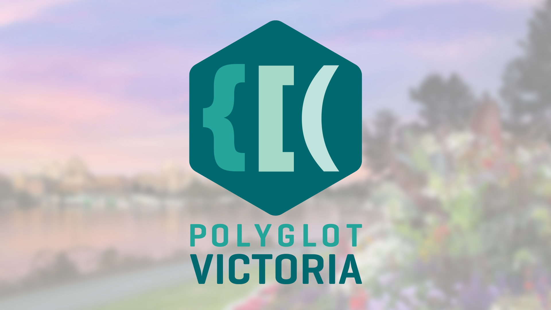
This logo was created in a tight turnaround window of a week with quick communication and feedback between myself and the client. Keeping the favicon in mind, the silhouette needed to remain readable in a single colour. Inspiration was drawn from the brackets commonly used in various coding languages as well as shapes like the hexagon--chosen for its appearance in Java iconography, and also as a nod to the honeycomb, a structure built by the hard work and skill of a considerable team (some busy bees).
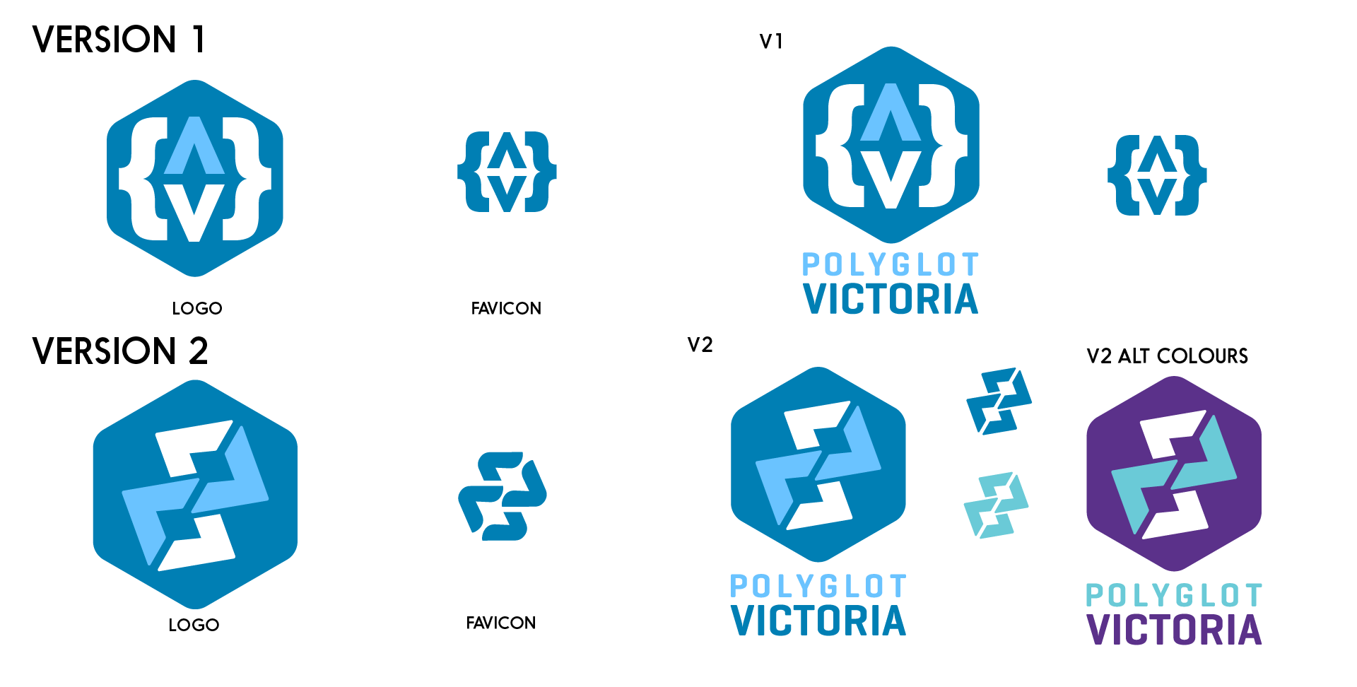
The original concept focused on the < > brackets, as turned on its side it resembles a V (for Victoria). However, the client was drawn more to the weight and variety of the brackets, so the V concept was dropped to refine the multi-bracket silhouettes. The colour scheme was also tweaked to move away from blue and purple--commonly used for tech startup logos--toward a teal tone. Ultimately the client's vision is the target, and I make it my job to refine that vision with my skillset and awareness of trends, typography, balance and legibility.