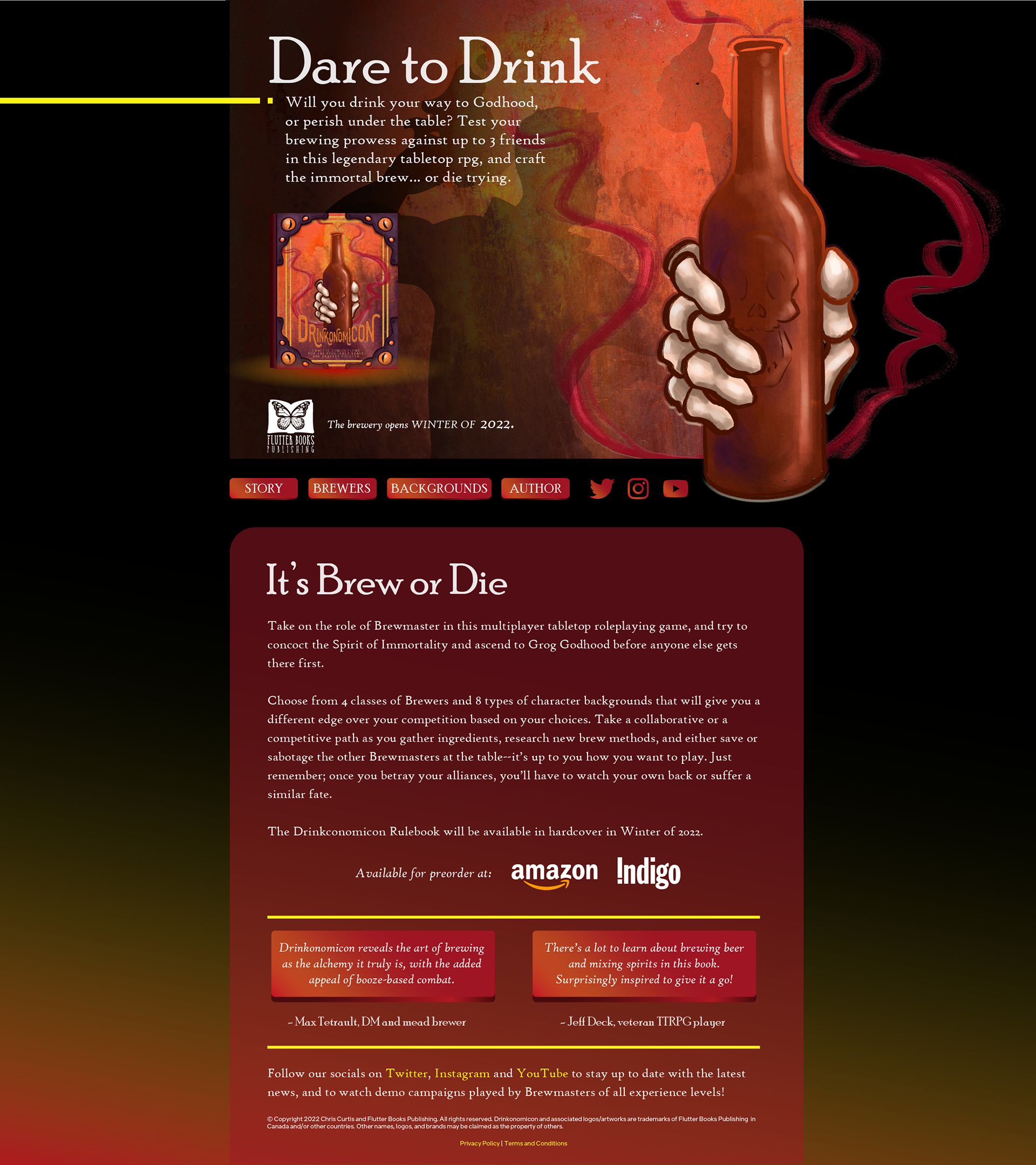
The marketing bundle includes sizes for all common social media platforms, web banners for sidebars, a simple "Landing page" style website layout for more detailed information on the book, and print assets for distribution at local events, such as gaming conventions.
I was also asked to generate a headline and a short "elevator pitch" style block of copy to use on the ads that would match the "dark magic" tone of the artwork and the game itself.
The smaller web banner uses a shorthand version of the copy without losing the tone or intrigue of the book's premise. When creating small web assets, I follow a set of strict typography guidelines to maintain readability and avoid crowding the composition.


The Landing Page offers more room for information on the TTRPG as well as testimonials from alpha and beta play testers, which were important to the author to highlight. I also created a layout for a responsive mobile version so that viewers can easily read up on the game from their phones.
It's important to me that a marketing package like this looks cohesive and translates the tone of the game across multiple platforms, while keeping information legible, digestible, and appealing.
Throughout the process of building a bundle like this, I like frequent feedback and value the thoughts of my clients and peers. The layman's eye is an invaluable asset!

