
Here you can see my process from start to finish for this logo. I was provided with a placeholder, the player character asset and a few examples of the rings to be implemented as flight targets. I always start with a silhouette test--a single tone (black) version of the logo to ensure the iconography and lettering are clean, balanced, legible, and functional--before proceeding with any texturing, colour or detail.
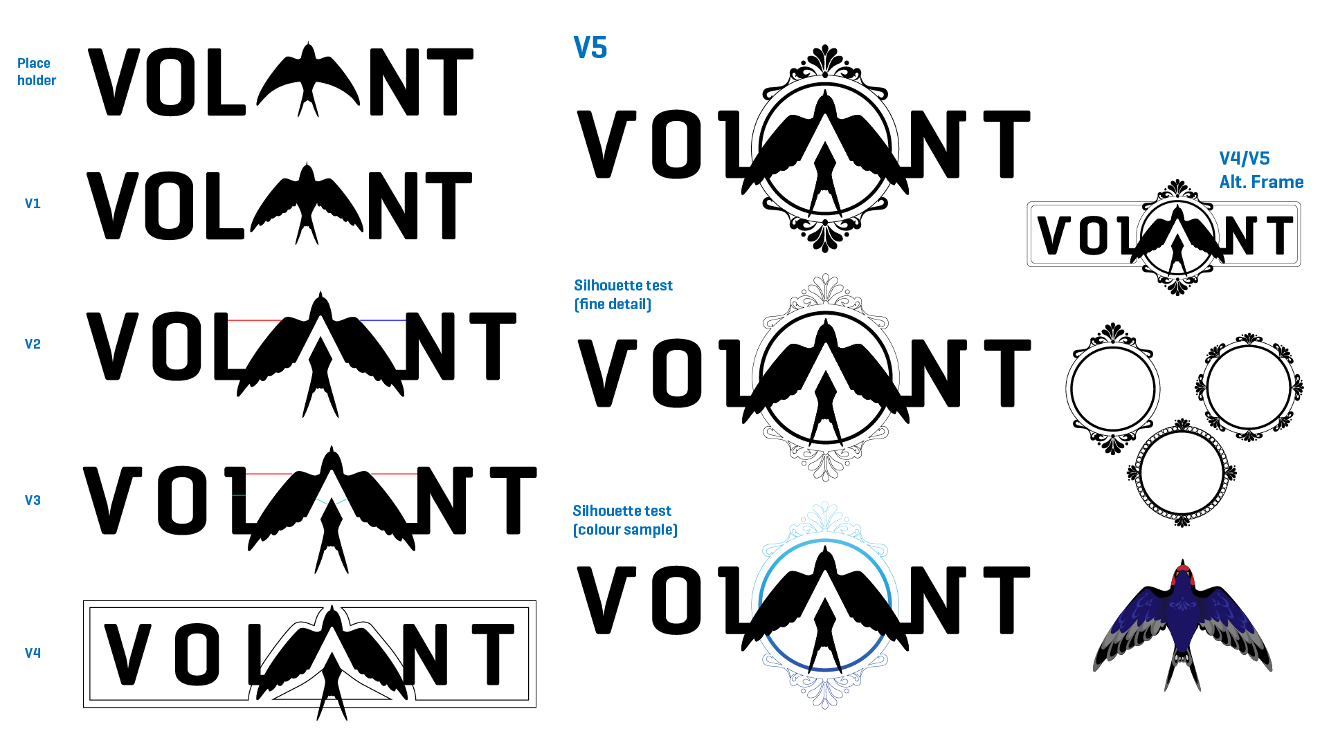
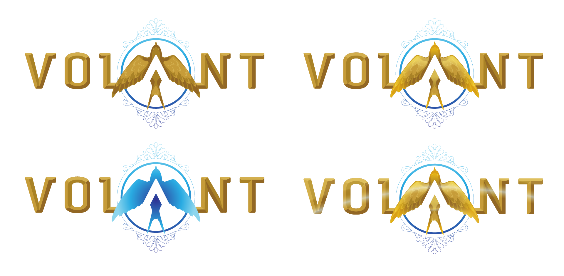
Once the silhouette is approved, effects can be implemented to match the style of the source material. In this case, the 4th version with the arc of reflected light was chosen as the final design, with the intention of animating the light reflection on the game's intro splash page. The swallow silhouette is also designed to serve as a recognizable standalone icon.