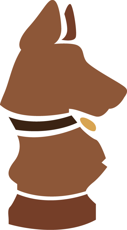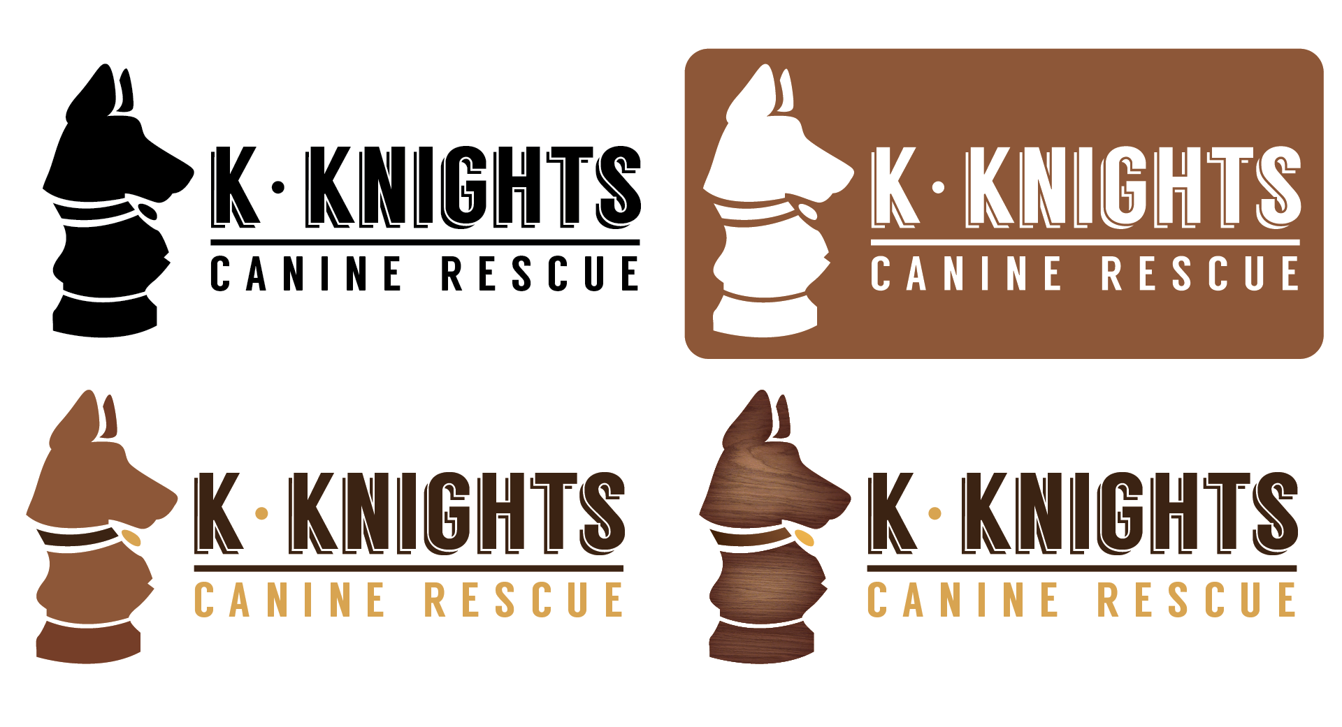
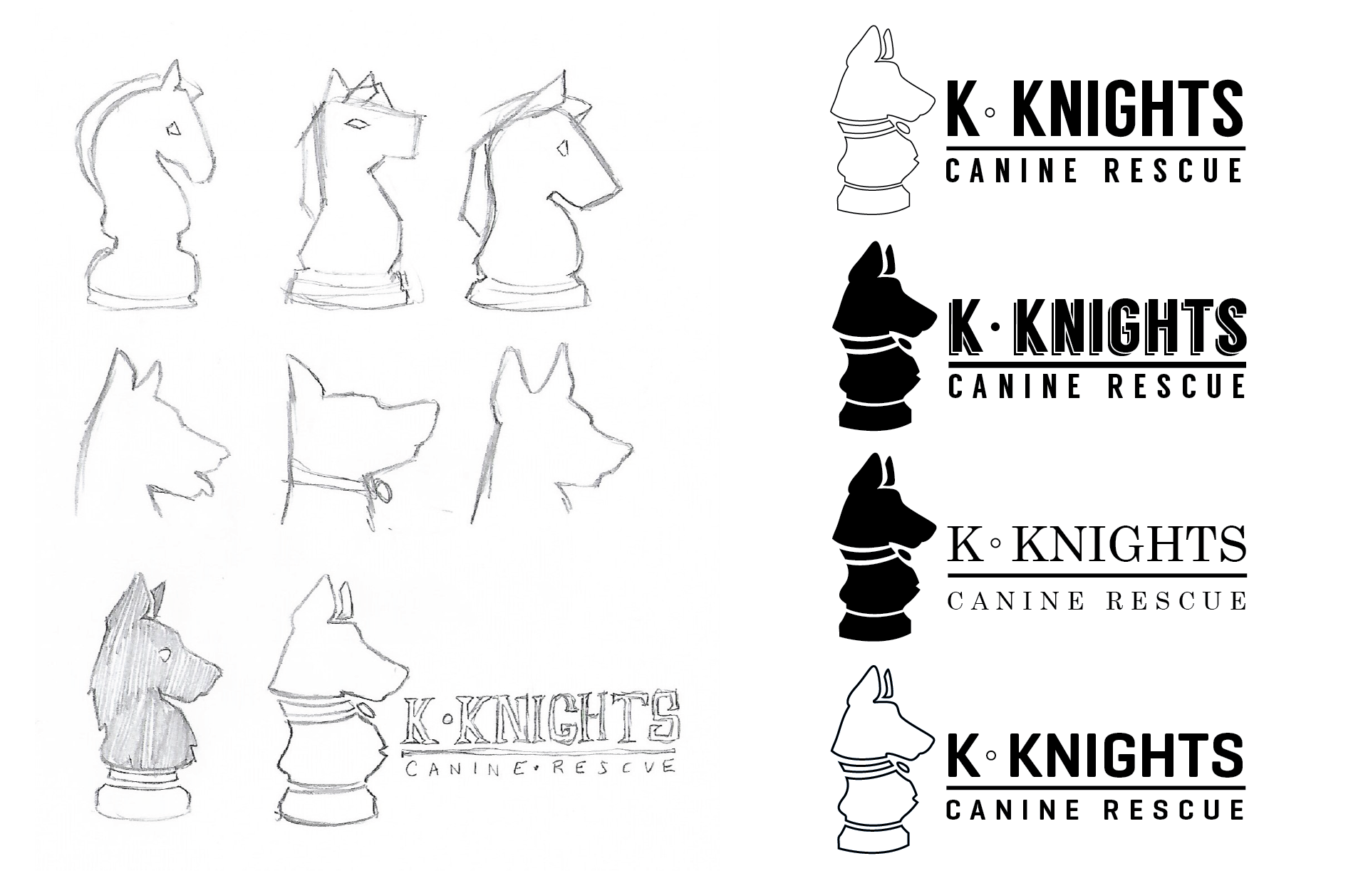
My process for this logo started with the simple prompt of a German Shepherd in profile combined with a Knight chess piece. After sketching out my base ideas, I start with a silhouette test--a single tone (black) version of the logo to ensure the iconography and lettering are clean, balanced, legible, and functional--before proceeding with any texturing, colour or detail. In this case I offered a few different font choices.
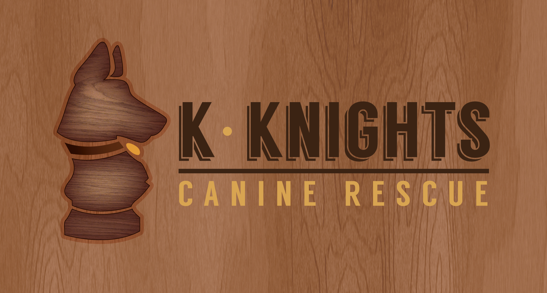
Once the silhouette was approved, I proposed a few different colour and texture treatments. I like to offer visually consistent but different treatment options to provide for multiple circumstances of use--in this case decals, web applications, a possible letterhead and signage burned into or printed on wood. A simple icon was also provided to use as a favicon and as a potential stamp for paper bags and dog gear.